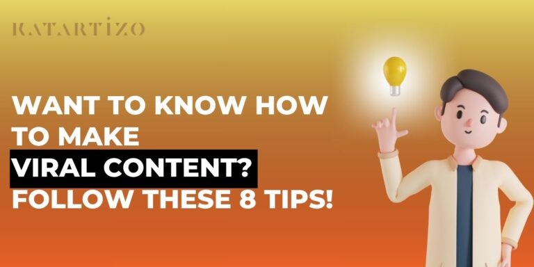
Your LinkedIn banner is often the first thing visitors see on your profile, yet 95% of LinkedIn banners have design mistakes that make them look unprofessional.
The problem? Most people only focus on dimensions and ignore how LinkedIn actually displays banners across devices. Text gets cropped on mobile, logos disappear behind profile photos, and what looks perfect on desktop appears broken on phones, where 60-70% of viewers see your profile.
This guide covers everything: exact LinkedIn banner size specifications, safe zones that prevent cropping, and the design mistakes that trip up most professionals.
Table of Contents
What Is the Size for a LinkedIn Banner?
1. Personal Profile Banner Size
| Specification | Value |
| Dimensions | 1584 × 396 pixels |
| Aspect Ratio | 4:1 |
| File Formats | JPG or PNG |
| Max File Size | 8 MB |
| Recommended DPI | 72 DPI (web display) |
2. Company Page Banner Size
| Specification | Value |
| Dimensions | 1128 × 191 pixels |
| Aspect Ratio | 5.9:1 |
| File Formats | JPG or PNG |
| Max File Size | 8 MB |
Why exact dimensions matter: When you upload an image that doesn’t match LinkedIn’s specifications, the platform will crop, stretch, or compress your banner, often all three at once. Text gets cut off, logos become distorted, and image quality deteriorates.
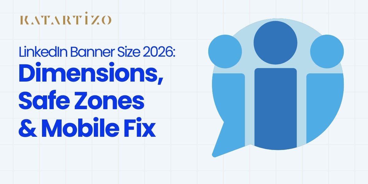
LinkedIn Banner Size in 2026: Has Anything Changed?
The official specifications remain the same in 2026. However, what has changed is how LinkedIn displays banners on mobile devices.
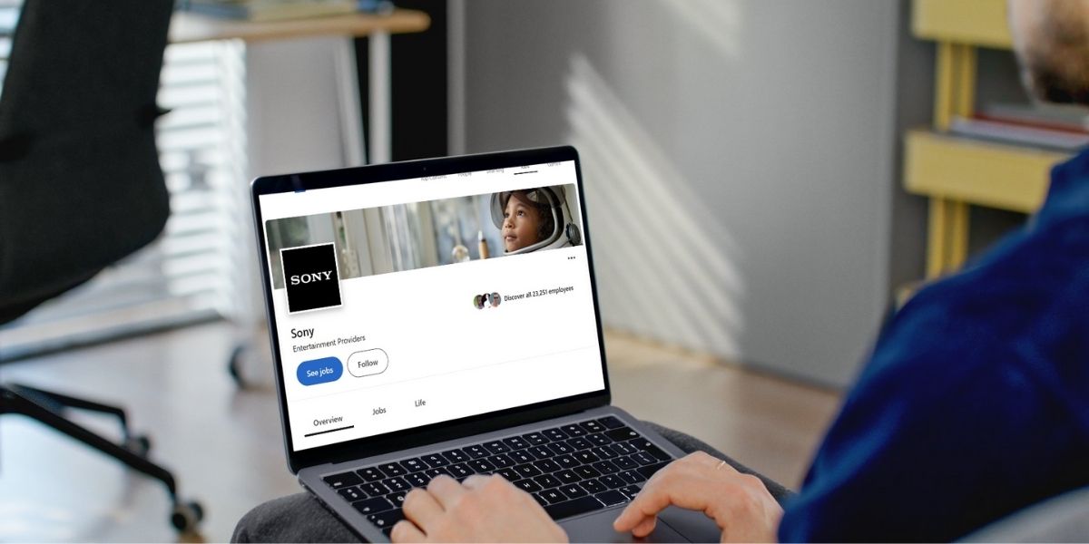
In January 2025, LinkedIn updated its mobile layout. The profile photo is now left-aligned on mobile (matching desktop), but the overlap area is significantly larger, approximately 568 × 264 pixels compared to desktop’s 200 × 200 pixel overlap.
What this means: Banners designed before 2025 may have worked on desktop but now have critical elements hidden on mobile, where most LinkedIn users actually view profiles
Why LinkedIn Banners Get Cropped (And How to Fix It)

Even with correct dimensions, your banner displays differently across devices due to:
- Profile photo overlap (covers part of your banner)
- Mobile vs desktop cropping (different visible areas)
- Screen size variations
1. The Profile Photo Overlap Problem
Your circular profile photo overlaps the banner in the lower-left corner:
| Device | Overlap Size | Impact |
| Desktop | ~200 × 200 pixels | Covers lower-left corner |
| Mobile | ~568 × 264 pixels | Covers significant left/bottom area |
Practical implication: Anything placed in the left third or bottom third will likely be hidden on mobile devices.
2. Desktop vs Mobile Cropping
| Device | Visible Banner Area | What Gets Cropped |
| Desktop | ~1584 × 312 pixels | Bottom 84 pixels |
| Mobile | ~1456 × 360 pixels | Left/right edges + more bottom |
3. The Safe Zone Solution
To ensure visibility on all devices, keep critical elements within:
Center 1000–1200 pixels horizontally × Center 200–300 pixels vertically
Simple rule: Design for the center and upper-right areas. Avoid the left third and bottom third entirely
How to Make a LinkedIn Banner Fit Properly
1. Safe Zone Design Rules
1. Center-first layout Place your primary message in the horizontal center, the only area visible on all devices.
2. Avoid the left third Never place logos, text, or critical elements in the left 400-500 pixels (profile photo will cover it).
3. Keep text in the upper half The bottom portion risks being covered by mobile profile photo overlap.
4. Test on mobile before publishing LinkedIn’s desktop preview doesn’t show real mobile rendering. Check on an actual phone.
2. Image Quality & Export Settings
| Format | When to Use | Export Quality |
| JPG | Photos, gradients, complex images | 80-90% quality |
| PNG | Logos, text-heavy designs | PNG-24 format |
Key specs:
- Export at 72 DPI for web (create at 300 DPI, then export at 72 DPI)
- Keep file size under 8 MB
- Avoid 100% JPG quality (creates unnecessarily large files)
- Slightly oversharpen to compensate for LinkedIn’s compression
Does 1080×1080 Work for LinkedIn?
No. Square images (1080 × 1080 pixels) do not work for LinkedIn banners.
LinkedIn banners have a 4:1 aspect ratio (four times wider than tall). A square image has a 1:1 ratio. When you upload a square image as a banner, LinkedIn will crop, stretch, or add padding, none of which look professional.
When 1080×1080 IS appropriate:
- LinkedIn post images (feed content)
- Profile photos (though 400 × 400 px is recommended)
- Company logos (300 × 300 px for company pages)
For banners, always use 1584 × 396 pixels for personal profiles or 1128 × 191 pixels for company pages.
LinkedIn Banner Size vs Other LinkedIn Image Sizes
LinkedIn uses different dimensions for different purposes:
| Image Type | Dimensions | Aspect Ratio | Purpose |
| Personal Profile Banner | 1584 × 396 px | 4:1 | Background image on profile |
| Company Page Banner | 1128 × 191 px | 5.9:1 | Background on company page |
| Profile Photo | 400 × 400 px | 1:1 | Circular photo next to name |
| Company Logo | 300 × 300 px | 1:1 | Square logo on company page |
| Post Image (Square) | 1200 × 1200 px | 1:1 | Feed images |
| Post Image (Landscape) | 1200 × 627 px | 1.91:1 | Horizontal feed images |
| Post Image (Portrait) | 1080 × 1350 px | 4:5 | Vertical feed images |
Each format serves a specific purpose. Trying to repurpose a banner as a post image (or vice versa) results in awkward cropping.
Choosing the Right Banner Layout Based on Your Goal
Not all LinkedIn banners serve the same purpose. Here’s how to approach design based on what you want to achieve:
1. For Job Seekers
If you’re looking for your next opportunity, your banner should immediately tell recruiters why they should consider you.
What to include:
- Clear career goal (“Seeking Product Manager Roles in B2B SaaS”)
- 5-7 core skills displayed as keywords
- Value statement with metrics or achievements
Design approach: Keep it minimal and professional. Recruiters scan profiles in under 10 seconds. Clean backgrounds with clear text work better than elaborate designs.
2. For Consultants & Service Providers
Your banner extends your business pitch.
What to include:
- Your logo or personal brand mark
- Professional tagline (“B2B SaaS Strategy & Growth”)
- Consistent brand colors
3. For Company Pages
Company banners must communicate value to multiple stakeholders, customers, employees, partners, investors.
What to include:
- Company logo (centered)
- Problem-solution value proposition
- Professional brand colors
- Tagline summarizing competitive advantage
Common LinkedIn Banner Mistakes (and How to Avoid Them)
1. Text Too Close to Edges
The mistake: Placing logos or text near the left, right, top, or bottom edges.
Why it fails: These areas get cropped on mobile, making text invisible to 60-70% of viewers.
The fix: Keep all critical elements within the center 1000 pixels horizontally and center 250 pixels vertically.
2. Overdesigned Canva Templates
The mistake: Using pre-made templates with excessive visual elements and competing colors.
Why it fails: Visual clutter makes it hard to grasp your message quickly. 96% of LinkedIn banners suffer from this.
The fix: Use blank templates and add only essential elements. Stick to 2-3 colors maximum.
3. Ignoring Mobile Preview
The mistake: Designing on desktop and assuming it looks the same on mobile.
Why it fails: Mobile crops more aggressively and has larger profile photo overlap.
The fix: Always test on an actual mobile device before finalizing.
4. Treating Banners Like Ads
The mistake: Cramming banners with bullet points, multiple CTAs, and promotional text.
Why it fails: Banners aren’t advertisements, they’re visual identifiers. Too much information overwhelms viewers.
The fix: One clear message is more powerful than five competing messages.
5. Low Contrast Text
The mistake: Light text on light backgrounds or text over busy photos.
Why it fails: If viewers have to squint, they won’t read it. Low contrast signals amateurism.
The fix: Maintain minimum 4.5:1 contrast ratio. Use solid backgrounds for text or add semi-transparent overlays.
6. Inconsistent Branding
The mistake: Banner colors/fonts don’t match your headline, About section, or website.
Why it fails: Inconsistent branding makes profiles feel disjointed. Aligned messaging converts 2-3x better.
The fix: Match banner colors to your brand palette and ensure tagline reinforces your headline.
Pre-Upload Checklist for LinkedIn Banners
Before uploading, verify:
1. Technical specifications:
- Dimensions: 1584 × 396 px (personal) or 1128 × 191 px (company)
- Format: JPG (80-90% quality) or PNG
- File size: Under 8 MB
- DPI: 72 minimum
2. Safe zone compliance:
- Critical text/logos in center 1000–1200 px horizontally
- No important elements in left third
- Text in upper two-thirds
- Tested on actual mobile device
3. Design quality:
- Text has sufficient contrast (4.5:1 minimum)
- Uses 2-3 colors maximum
- One clear primary message
- No blurriness or pixelation
4. Strategic alignment:
- Banner messaging matches headline and About section
- Colors consistent with brand identity
- Value proposition is specific (not generic)
When Professional Design Help Makes Sense
The difference between an amateur banner and a professional one can be the difference between landing clients, attracting recruiters, or being overlooked entirely.
When to consider professional design:
- Your LinkedIn generates significant business value (leads, partnerships, opportunities)
- You’ve tried DIY but aren’t confident in the results
- Your industry is competitive and visual differentiation matters
- You don’t have time to learn design software
For Singapore-based businesses and professionals, agencies like Katartizo specialize in social media marketing and graphic design that translates business goals into professional visual assets. Whether you need a LinkedIn banner that positions you as an authority, or you’re exploring LinkedIn ads or considering which platforms deliver the best advertising results, professional support can accelerate results while freeing you to focus on your core business.
Final Thoughts
Your LinkedIn banner isn’t just decorative, it’s a strategic tool that communicates who you are, what you do, and why it matters, all within seconds.
Getting the dimensions right (1584 × 396 pixels for personal profiles, 1128 × 191 pixels for company pages) is just the starting point. The real challenge is understanding how LinkedIn displays banners across devices, where safe zones are, and what design choices separate professionals from amateurs.
Most professionals get this wrong, which means getting it right immediately differentiates you. A properly designed banner that’s optimized for mobile, uses safe zones correctly, and communicates a clear value proposition will outperform 95% of the banners on LinkedIn.
Whether you’re handling this yourself or working with a Singapore digital marketing agency to refine your LinkedIn presence, the principles remain the same: start with the technical specs, test on mobile, keep your design simple and centered, and ensure your banner reinforces the same message as your headline and About section. Do that, and you’re already ahead of nearly everyone else.